
Dare to be Different!
Daring to be different with your window treatments can breathe new life into the feeling of your home. Anyone can select a simple plain neutral fabric and use it for creating functional draperies, roman shades, or roller shades. If you have a lot of artwork or energetic wall colors, that may be the best solution. But if your walls and main furniture pieces are neutral, using neutral fabrics on the windows will make the entire room feel low energy – or boring! We would love to work with you to find something truly unique to you and your lifestyle. Take some time to think about these considerations before making your fabric selection:

Step 1: Write down three words you would use to describe how you want the room to feel. For a living room you might say “warm, inviting, welcoming.” For a playroom you might say “energetic, fun, playful.” For the bedroom you might say “serene, seductive, calming.”
Step 2: Now add colors to the words that further describe how you want the room to feel. For the playful and energetic playroom, you might end up with a multi-color theme using complimentary primary colors such as red and green.
Step 3: If you really want to complete the look with designer touches, don’t stop without adding trim to your design. This dotted shade continues the playful theme by adding the pom-pom trim on the shade valance and at the hem.

Now let’s apply the same technique to this semi-formal craftsman dining room. The walls are already a dramatic plum color, and the trim is beautiful, so enhance those two features with equally beautiful, but subtle gray and white geometric print fabric. The fabric color choice gives you complete license to change the wall color in future without needing a change to the shade, and the pattern adds the interest you need inside this white trim.
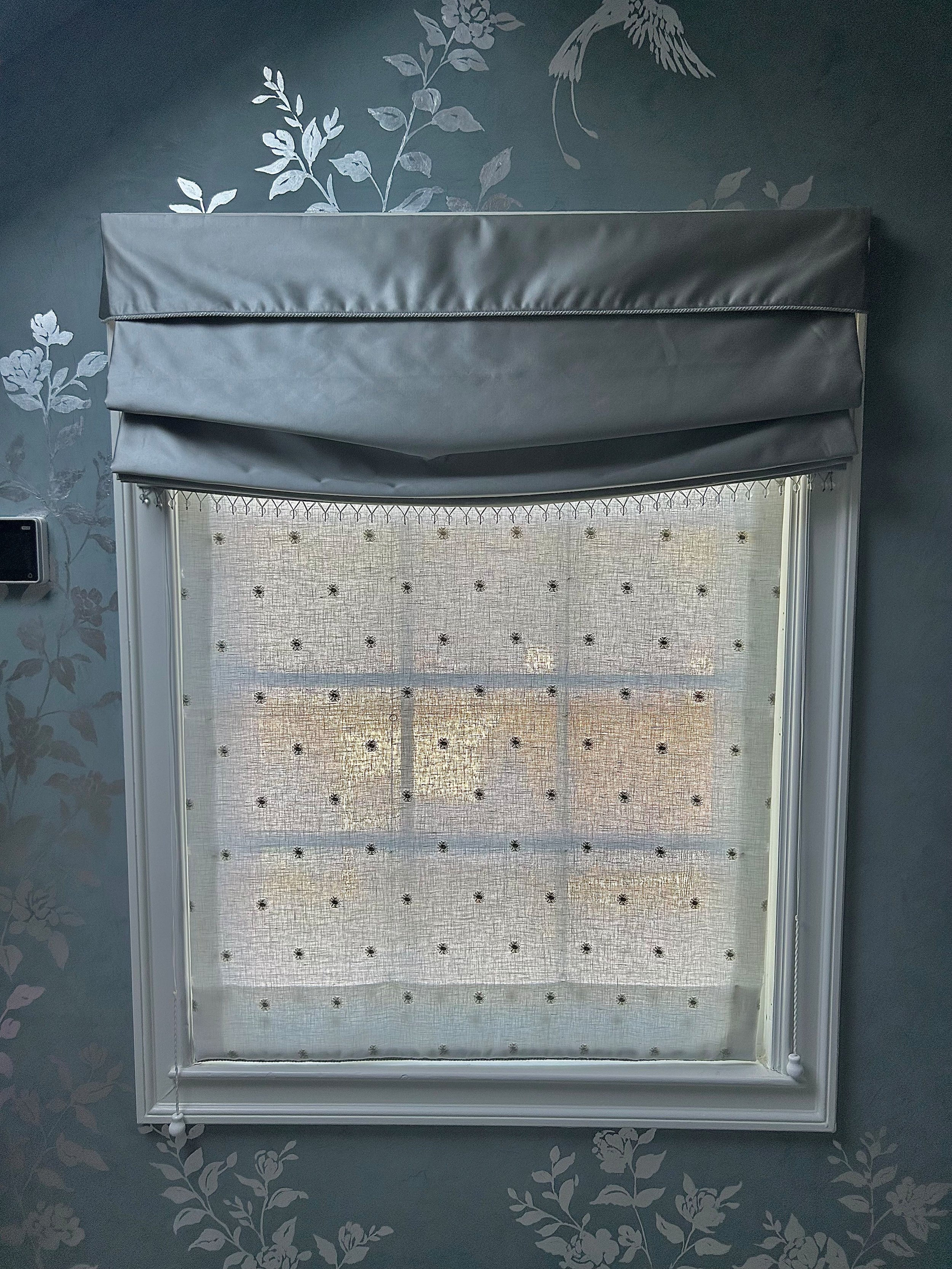
This primary bath has gorgeous blue venetian plaster with hand-painted vines and silver birds. The feeling of the room is elegant, traditional, and a tiny bit whimsical. Since both privacy and light are important, we used a 2-shade solution. The light-filtering under shade provides daytime privacy but isn’t plain white – note the embroidered dots pattern that adds interest to what would be a very boring white shade without that little detail in the fabric. The over shade has blackout lining so that no light travels from the bathroom into the bedroom at night. Although the overshade is a simple blue satin, note the beautiful crystal drop trim at the hem of the shade, and the cord trim on the valance hem. Also, this relaxed roman shade has a soft curve at the bottom to add elegance that goes along with the overall feeling of the room.

Be not afraid of the bold pattern like this tiger print! This client’s home is an eclectic international collection of treasures and stories from around the world. They are not afraid of color or pattern and use is with abandon throughout their home which represents how this active young family lives. With something this energetic, you might think it would be mandatory to have white walls…but think how beautiful this room would be with a bold color picked up from the background of the tiger print.
Whether you choose bold patterns, innovative materials, or striking detailed trim, taking time to explore options that reflect your personality can transform your living space into something truly magazine-worthy.